Презентация на тему: Веб-дизайн

Web-design
Web design What is it? Web-design features Before…
What is it? The arrangement and creation of web pages that in turn make up a web site. There are many aspects to this process, and due to the rapid development of the Internet, new aspects are continually being added. As far as business oriented web sites go, the basics currently consist of: a) The "visibility" of the site on the Internet, particularly within the major Search Engines. b) The informational value of the site, from its target public's point of view. c) The aesthetic / professional appearance of the pages. Theoretical layout of graphics, text, and images which will eventually be developed into a Web site
The basic aspects are The site design is defined by the topic and content. The content, substance, and information on the site should be relevant to the site. The site should be user-friendly, with the interface and navigation simple and reliable. The appearance should include a single style that flows throughout, to show consistency. The visibility of the site's text and information should be paramount as that is what the users are visiting for. The site must also be easy to find on the internet
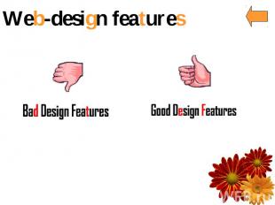
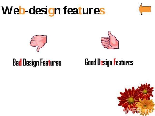
Good design features Text Navigation Links Graphics General Design
Text Background does not interrupt the text Text is big enough to read, but not too big The hierarchy of information is perfectly clear Columns of text are narrower than in a book to make reading easier on the screen
Navigation Navigation buttons and bars are easy to understand and use Navigation is consistent throughout web site Navigation buttons and bars provide the visitor with a clue as to where they are, what page of the site they are currently on Frames, if used, are not obtrusive A large site has an index or site map

Links Link colors coordinate with page colors Links are underlined so they are instantly clear to the visitor
Graphics Buttons are not big and dorky Every graphic link has a matching text link Graphics and backgrounds use browser-safe colors Animated graphics turn off by themselves
General Design Pages download quickly First page and home page fit into 640 x 460 pixel space Good use of graphic elements (photos, subheads, pull quotes) to break up large areas of text Every web page in the site looks like it belongs to the same site; there are repetitive elements that carry throughout the pages

Bad design features Backgrounds Text Navigation Blinking and animations Links General Design

Backgrounds Default grey color Color combinations of text and background that make the text hard to read Busy, distracting backgrounds that make the text hard to read
Text Text that is too small to read Text that stretches all the way across the page Centered type over flush left body copy Paragraphs of type in all caps Paragraphs of type in bold Paragraphs of type in italic Paragraphs of type in all caps, bold, and italic all at once Underlined text that is not a link

Navigation Unclear navigation; over complex navigation Complicated frames, too many frames, unnecessary scroll bars in frames No links back to where they came from, no identification Useless page titles that don't explain what the page is about
Blinking and animations Anything that blinks, especially text Rainbow rules that blink or animate Animated pictures for e-mail Animations that never stop Multiple animations that never stop
Links Links that are not clear about where they will take you Links in body copy that distract readers and lead them off to remote, useless pages Text links that are not underlined so you don't know they are links Dead links
General Design Entry page or home page that does not fit within standard browser window Frames that make you scroll sideways Navigation buttons as the only visual interest, especially when they're large Cluttered, not enough alignment of elements Lack of contrast Pages that look okay in one browser but not in another
Before… Before creating and uploading a website, it is important to take the time to plan exactly what is needed in the website. Define the purpose Define the audience Plan documentation

Good luck
